Chart Types
Content Chimera has a wide range of built in chart types that are useful for content analysis, including these types:
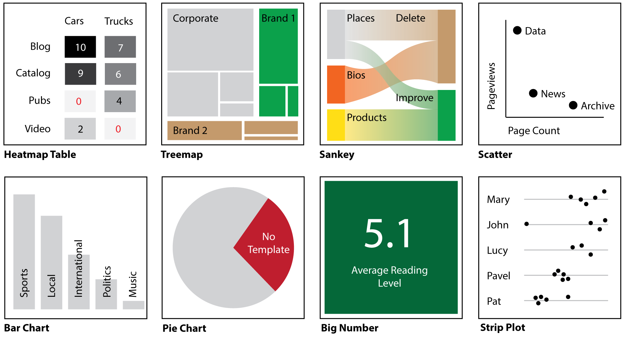
Choosing the right chart type
In general you want to use the simplest chart that will meet your communication goal. For instance, if you are in doubt then use the bar chart. Some chart types can require a more sophisticated viewer with more explanation from you. Some types of charts are bit more clear than others:
In general, prefer Bar Charts (and only use Pie Charts when there are a very small number of values). Bar Charts are the easiest visually for people to understand and are used so frequently that they are well understood.
If you have hierarchical data, then you probably want a Treemap, Icicle chart, or Sunburst. These are the only charts that explicitly communicate hierarchy. Example hierarchies would be folder1 / folder2 / folder3, content type / content sub type, site type / site, owning division / product category / product.
If you are comparing two categories (example: content type vs. topic by pageviews), use a Heatmap Table. If you are comparing the pervasiveness (presence broadly across a digital presence) of multiple fields (especially scraped values) then consider a Pervasiveness Table. See comparison of table types for more.
If you are comparing two metrics (two number values, like page views and page count) then a Scatter Chart is ideal. This is the only chart type that explicitly compares two number values.
If you are showing a from→to relationship (a frequent case in digital transformation planning!), then use a Sankey Diagram.
If you are attempting to compare average values across categories (like average pageviews per content type), consider a Strip Plot which illustrates more nuance than, for example, a bar chart simply showing averages.
Also try the Chart Selection Wizard.
Switching chart types and special fields
Different charts use different fields (some required and some optional). The needs of each chart is explained in its detailed section on this page.
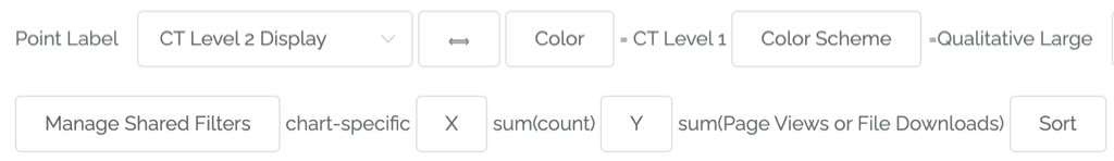
In many cases Chimera attempts to intelligently change the fields for you so you don’t need to set all the fields again, like in the example below. That said, if you are switching from a chart type that requires more configuration then you will get an error and need to add that information (such as adding another metric for the Y axis when switching to a scatter chart from a bar chart).
Comparison of all chart types
This is simply a brief comparison of the chart types. Details of each type are in the following sections.
Primary Use |
Special Needs |
Example |
|
|---|---|---|---|
Bar / Horizontal Bar |
Relative Amounts (no hierarchy) |
No |
Basic Site Structure* |
Treemap / Icicle / Sunburst |
Hierarchy |
Data must be hierarchical |
Deep Site Structure* (folder1/2/3) |
Heatmap Table |
“Coverage” |
Small set of categories (# of rows & columns) |
Author by folder |
Pervasiveness |
Pervasiveness of presence of values |
Multiple “Has” fields (from scrapes) |
Across a digital presence, how often are there tables and bad character encodings |
Sankey Diagram |
Flow |
Ideally data is logically to→from |
From folder to migration treatments |
Scatter |
Compare two numeric values |
Two numeric values |
Avg page count by avg page views, labeled by folder |
Pie |
Showing preponderance / dearth of something |
Very small set of categories |
Percent of pages with bad character encodings |
Strip Plot |
Comparing the range of values between categories |
Small number of categories and point labels |
Range of page views per content type |
* Default Content Chimera chart (in the chart pulldown)
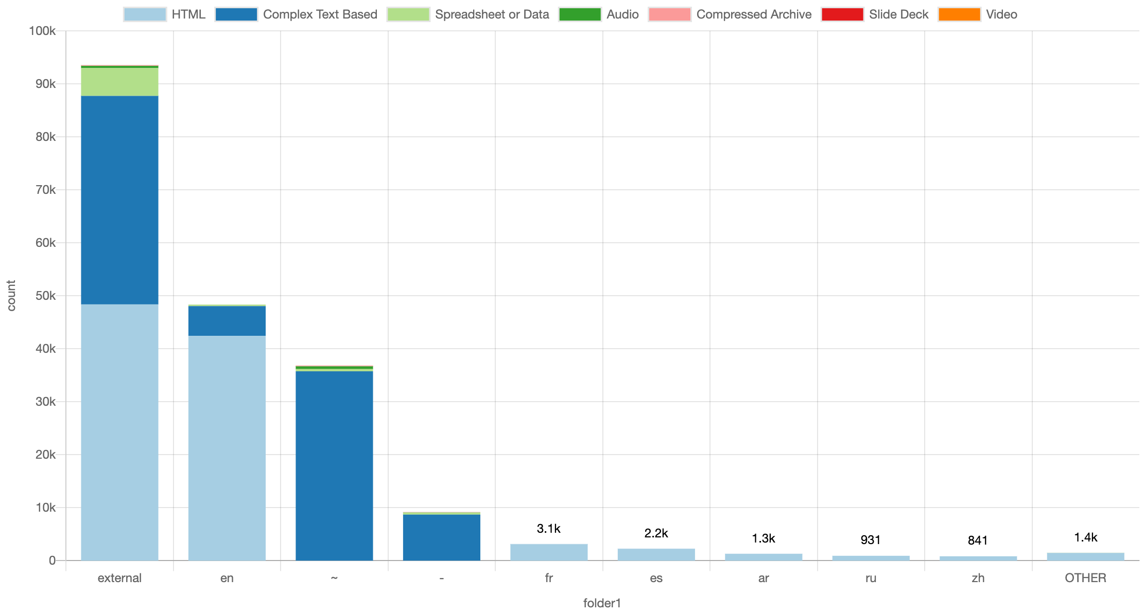
Bar / Horizontal Bar
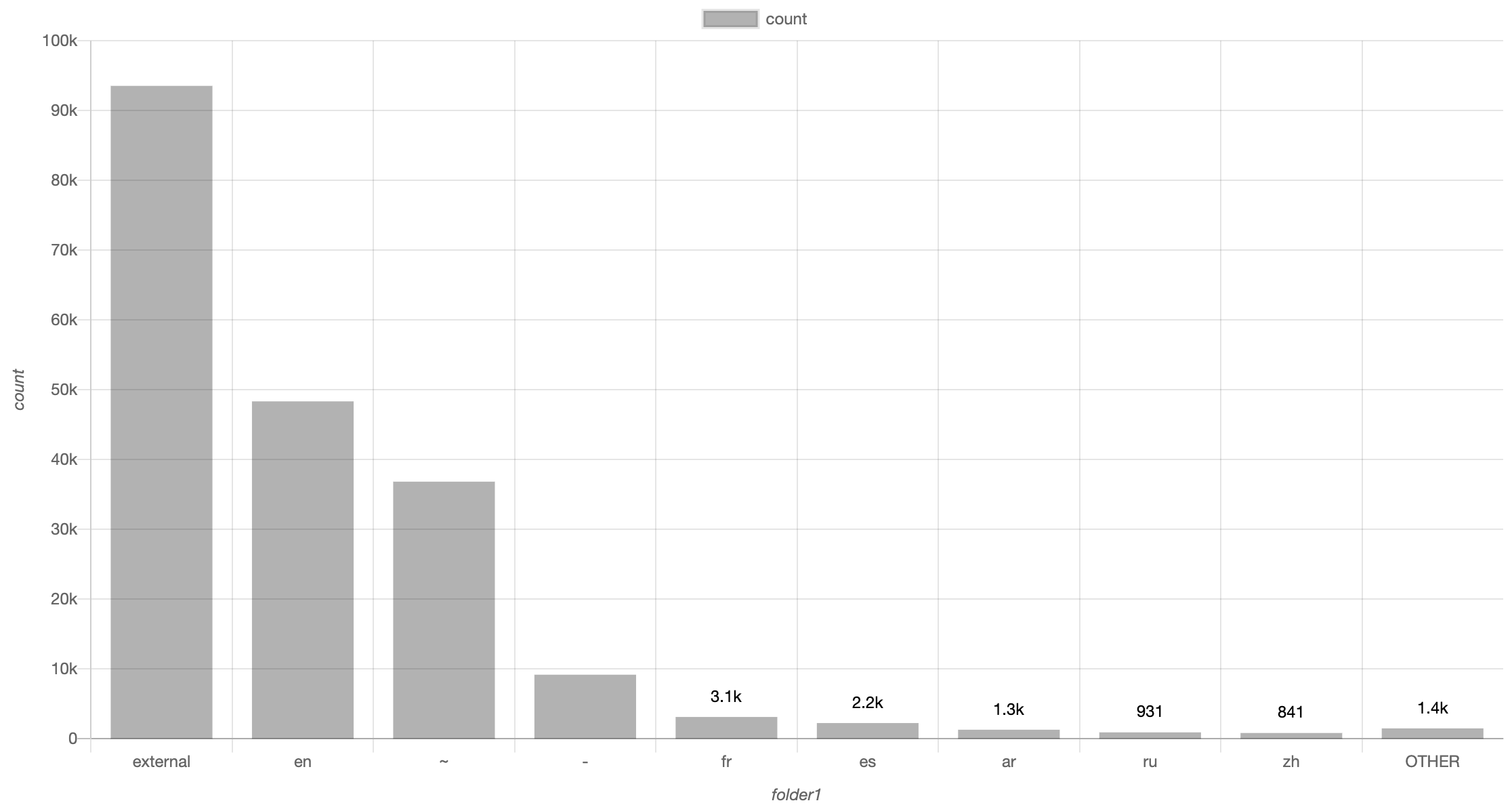
Bar charts are the king of charts. They are easy to understand visually (humans can differentiate and compare the sizes of bars effectively) and cognitively. The are also easy to configure: you just need to set the “Distribution of” field.
If you want to show horizontal bars instead of vertical, just select Horizontal Bar instead.
Sometimes it is effective to break down charts with colors, in which case you select a value for the Color field:
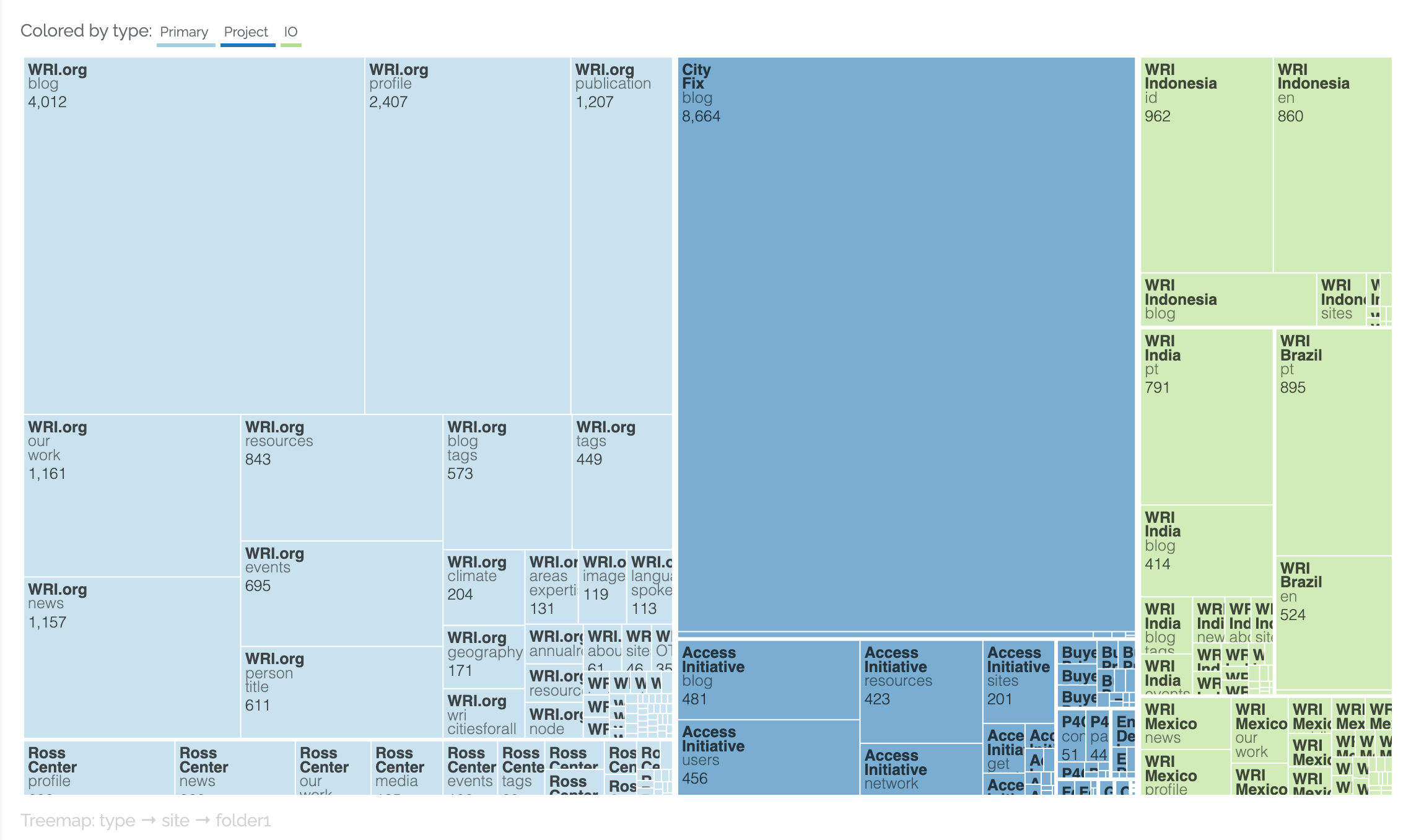
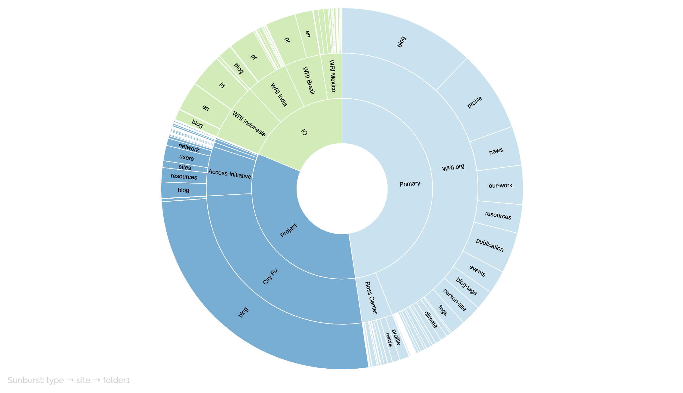
Treemap / Icicle / Sunburst
The treemap, icicle, and sunburst charts all represent hierarchical information. The same information is presented in each of the following charts.
Treemap:
Sunburst:
Icicle:
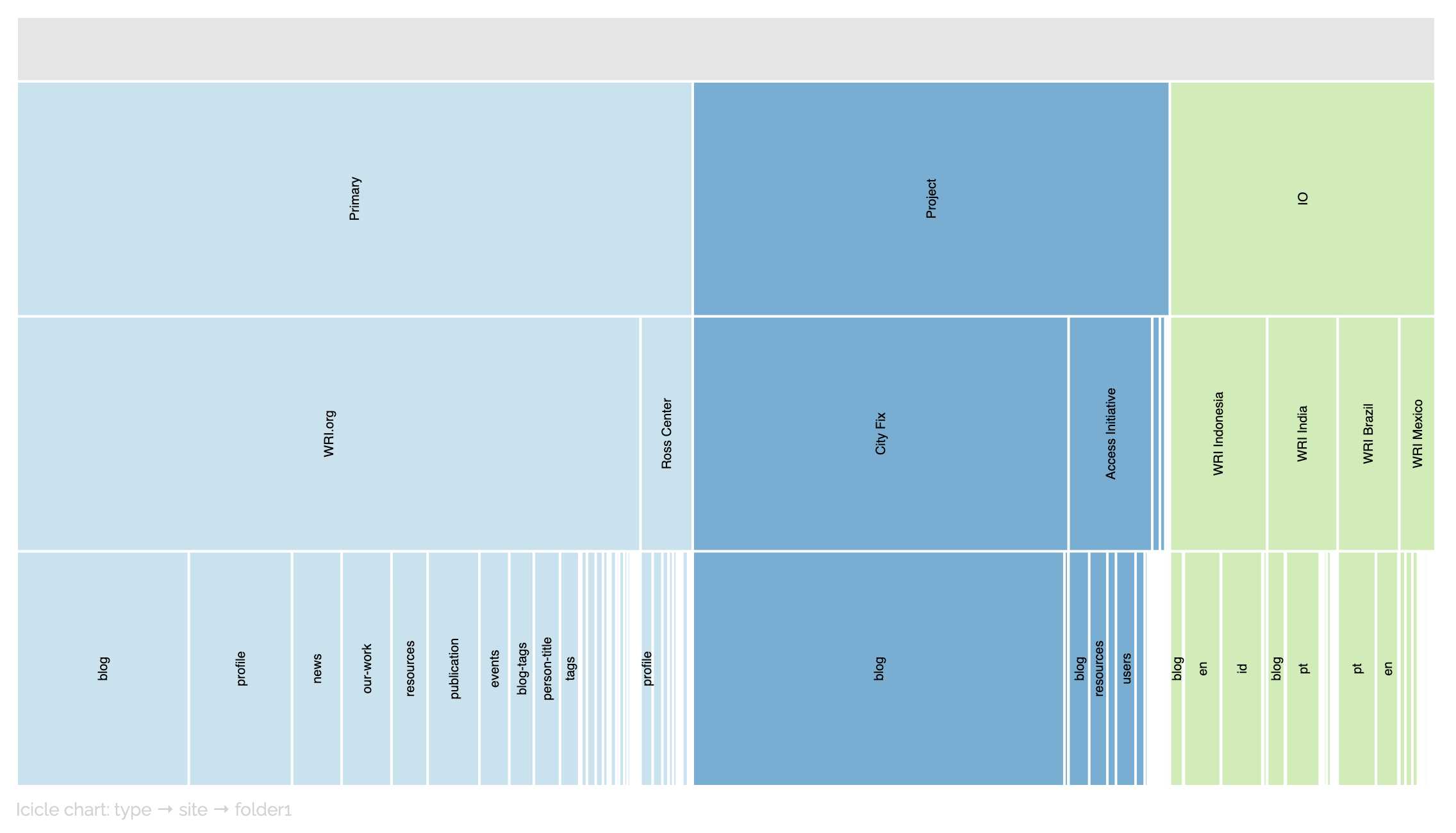
The configuration if these is straightforward, setting either two or three levels. The fields are Level 1, Level 2, and Level 3. For example, this is the configuration of the above chart:

Note
Content Chimera does not attempt to validate whether the data is truly hierarchical, but if it isn’t then the charts will not work correctly. To be hierarchical means that all values of a lower level are included in the higher level – for instance, if Level 1 is Food Type (with values Fruit and Vegetable) and Level 2 is Food (with values like Tomato and Orange) then every instance of each value must always be a child of all instances of the parent value (so for example Level 2 = Tomato would always have to have Level 1 = Vegetable).
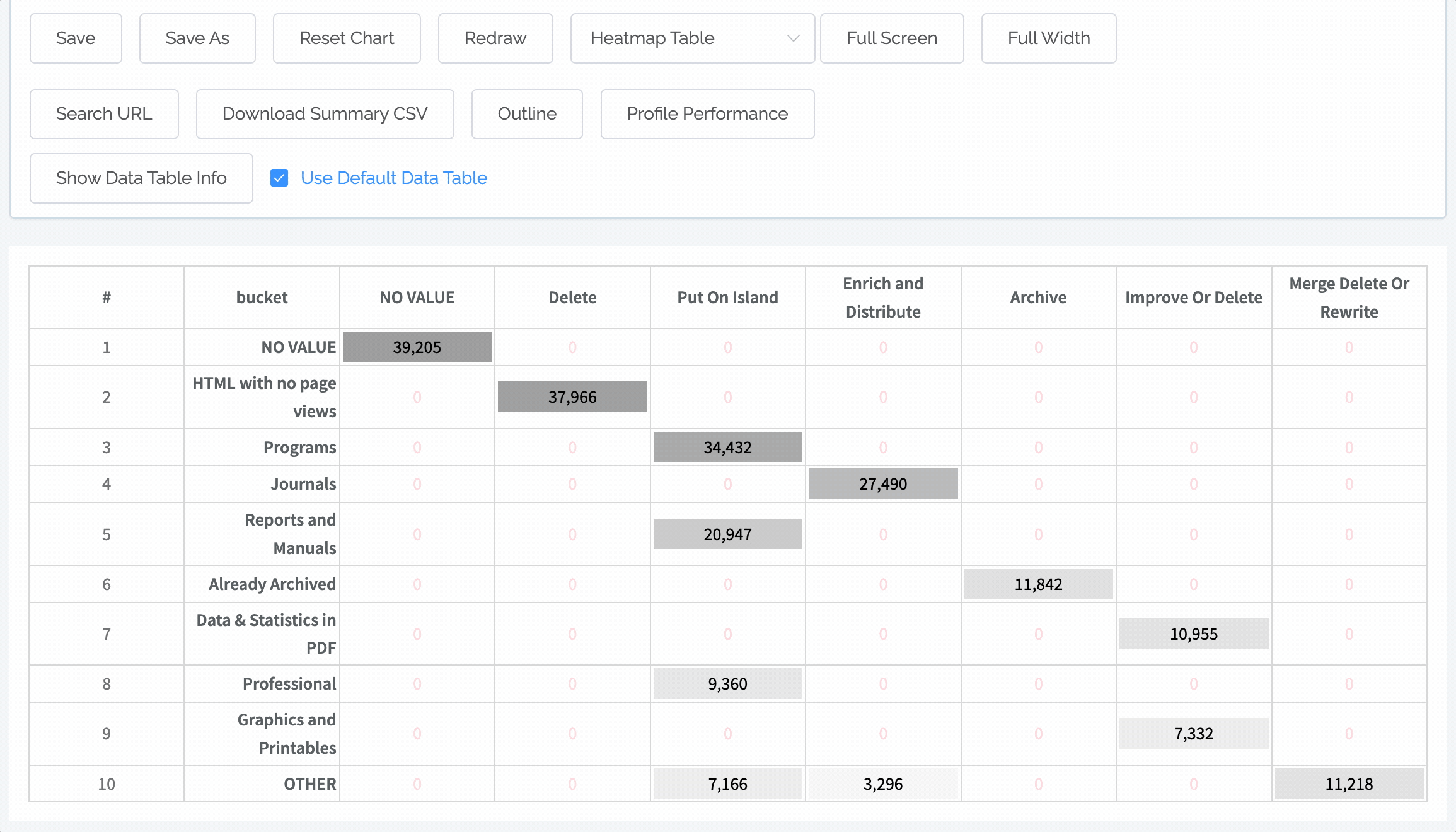
Heatmap Table
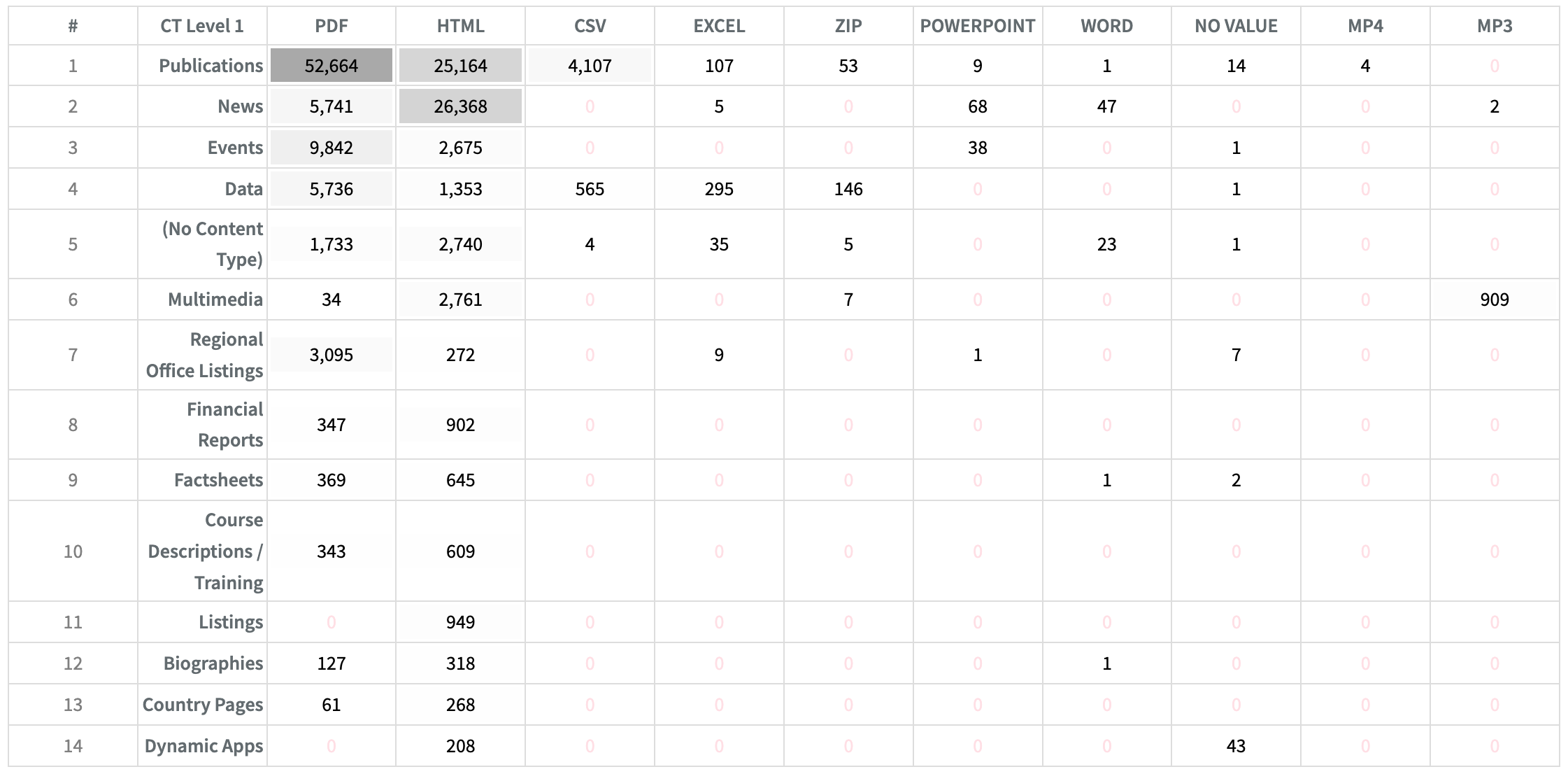
Heatmap tables create a table comparing the values of two fields (one field has the values for the rows and another field has the values for the columns). The cells are shaded based on the values (the largest value having a black background and the lowest value having a white background).
These are configured with these fields:
Rows. What field should be used to determine rows.
Columns. What field should be used to determine columns.

Pervasiveness Table
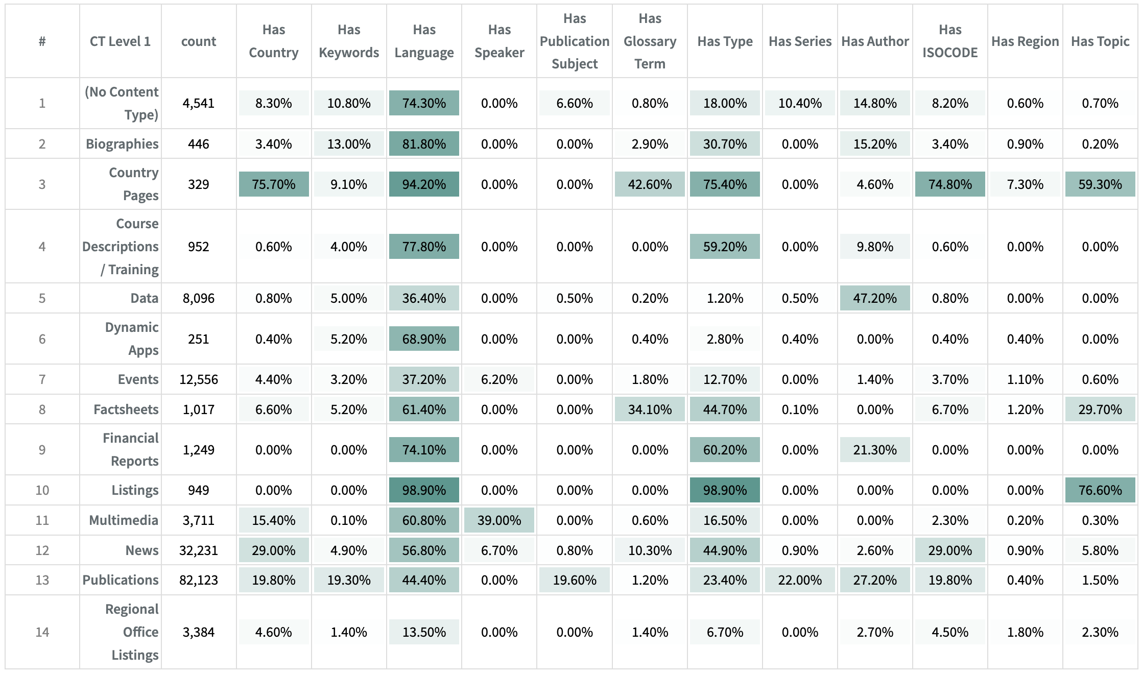
Sometimes you want to see if a set of scraped patterns were found across a digital presence. A pervasiveness table allows you to do this. For instance, the table above was used by an organization in an internal search optimization project in order to determine how close certain fields were to being useful in search (if almost no content had a value for a field then it would be of limited use).
These are the fields to configure a pervasiveness table:
Rows. How the underlying data will be grouped into rows.
Columns. The fields “Has” fields that should be compared. Note that the fields should be comma separated and without any spaces between the field names. Scraped patterns automatically include a “Has” field.
Color Scheme (optional). You can select whether Yes is positive (in which case it is green) or negative (in which case it will be red).

Comparing Table Types
See the article Pervasiveness and Heatmap Tables: Visualizing the Big Picture for more discussion on this topic.
How columns determined |
Required column types |
Cell values |
|
|---|---|---|---|
Heatmap Table |
Values of a field |
Categorical |
Any Aggregation (sum, avg…) |
Pervasiveness Table |
Manually specified list of fields |
“Has” fields, with values of Yes and null |
% of Yes |
Sankey Diagram
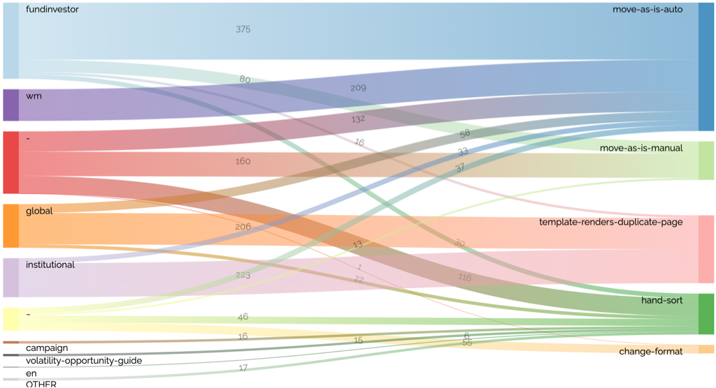
A Sankey Diagram illustrates a flow, from one category to another. So the primary fields for a Sankey Diagram are the “from” and “to” fields. In the example above, the from is folder1 (with values “fundinvestor”, “wm”, etc) and to disposition (with values such as “move-as-is-auto”):

Scatter
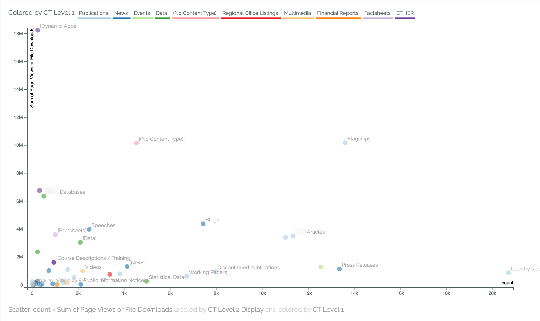
A Scatter Plot compares two numeric values. The primary settings required for scatter plots are:
Numeric value on the X (horizontal) access.
Numeric value on the Y (vertical) access.
Point Label. A scatter chart will usually be summarizing a lot more data than is shown in the chart. The Point Label is the field that determines what defines the point on the chart. For instance, in the chart above each point represents a content type (for that analysis, this was called CT Level 2 Display), so the X and Y values are aggregating all the content into each content type.
Color (optional). This is how the points are colored. In the example above, the color is based on the overall groups of content types (called CT Level 1 in this example analysis) which means that multiple points will get the same color.
This is how the chart above is configured:
Pie
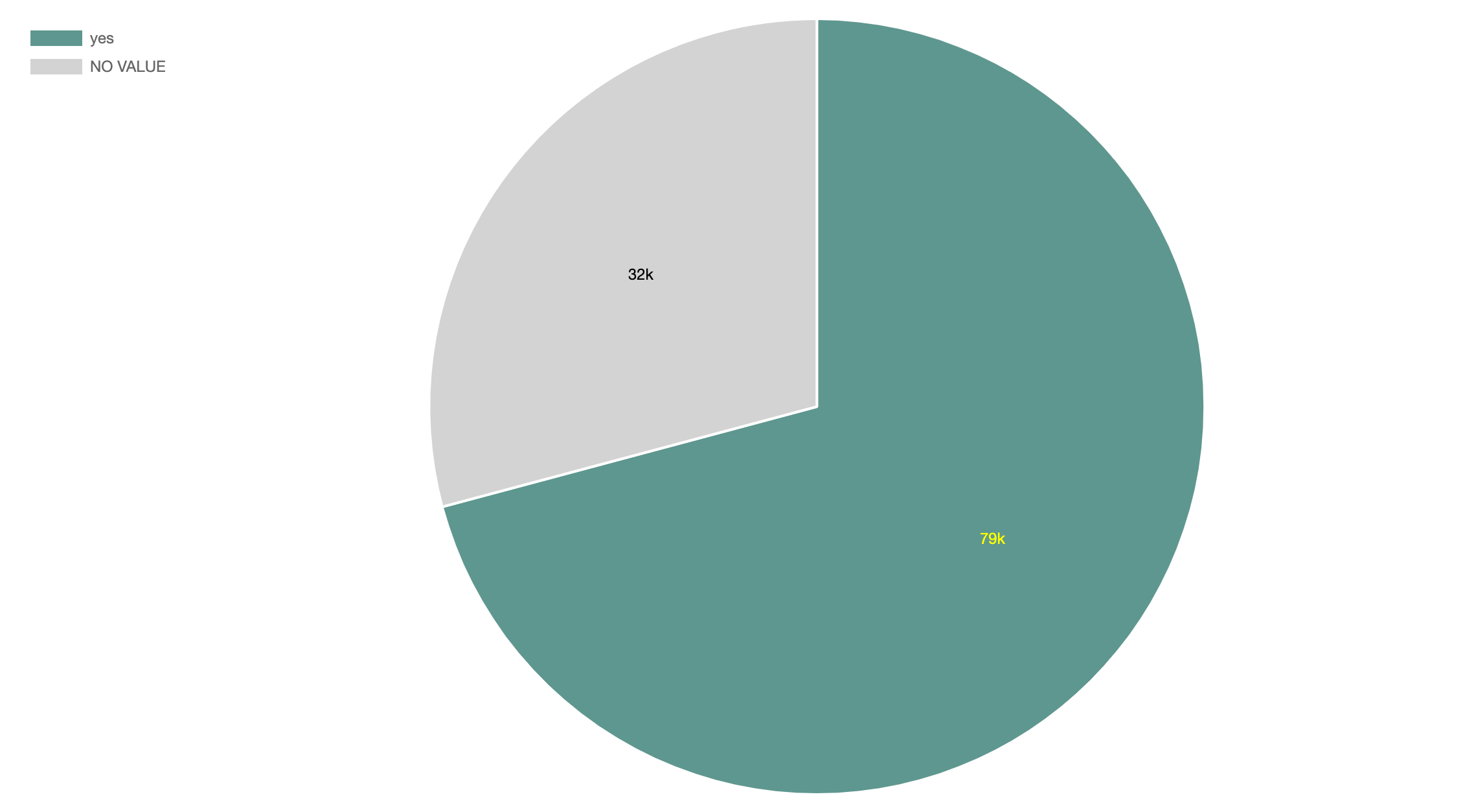
Pie charts should only be used when there are only a small number of wedges in the chart. Ideally there are just two values, like in the example above. In addition to the usual size field, the two fields that are relevant to a pie chart are:
Distribution of. In the example above, this is the relative frequency of the Has Template Version field, which only has a yes or “no value” value.
Color Scheme (option). The real value of a pie chart is in narrowly isolating a particular issue, and often providing a judgement on that value. In this case, having a template version is a good thing (otherwise it’s a nonstandard page), so we select the color scheme Yes Positive.

Strip Plot
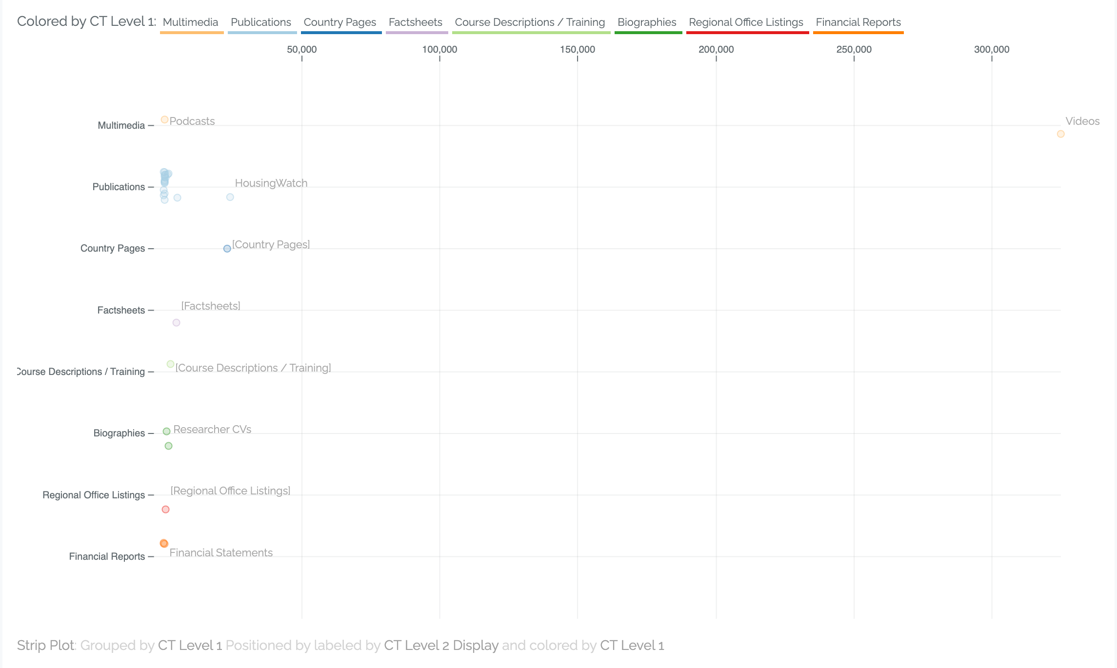
If you are ever tempted to do a bar chart or other chart to compare average values across a digital presence (for example, average pageviews for each site of a large digital presence), consider a strip plot instead. This provides more nuance to the analysis, such as seeing if there are outliers per category (like each site).
The fields here are a little subtle:
Group. This is how all the points will be grouped into rows in the chart.
Point Label. How the underlying data will be aggregated into individual points.
Color (optional). How the different dots are colored – in general the best approach is to color by the group, so that you have some redundant information in the chart for clarity.

See the excellent Don’t Compare Averages by Martin Fowler, which convinced us to implement strip plots.
